
Understanding Box Plots: A Guide with Python and R Codes


Understanding Box Plots: A Guide with Python and R Codes

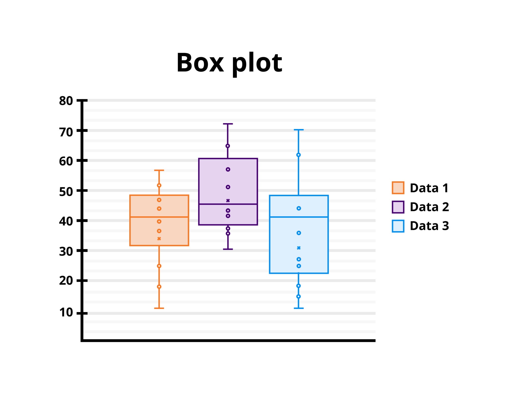
Box plots, also known as box-and-whisker plots, are a standard way to visualize the distribution of a dataset based on five key summary statistics: the minimum, first quartile (Q1), median, third quartile (Q3), and maximum. They are especially useful for identifying outliers and understanding the spread and symmetry of the data.


Key Components of a Box Plot

  1. Median: The line inside the box represents the median of the data.
  2. Quartiles: The edges of the box represent Q1 (25th percentile) and Q3 (75th percentile).
  3. Interquartile Range (IQR): The difference between Q3 and Q1. It represents the spread of the middle 50% of the data.
  4. Whiskers: Extend from the box to the smallest and largest values within 1.5 times the IQR from the quartiles.
  5. Outliers: Data points beyond the whiskers are plotted as individual points.


Why Use Box Plots?

  • Quick overview of data distribution
  • Identify outliers
  • Compare distributions across different categories

Creating Box Plots in Python

Python's matplotlib and seaborn libraries provide excellent tools for creating box plots.

Example 1: Box Plot with Matplotlib

import matplotlib.pyplot as plt
import numpy as np

# Sample data
data = [7, 8, 8, 9, 10, 10, 12, 14, 15, 18, 22, 23, 25, 30]

# Create the box plot
plt.boxplot(data)
plt.title("Box Plot Example with Matplotlib")
plt.ylabel("Values")
plt.show()

Example 2: Box Plot with Seaborn

import seaborn as sns
import pandas as pd

# Sample data
data = pd.DataFrame({
    'Category': ['A', 'A', 'A', 'B', 'B', 'B'],
    'Values': [10, 12, 14, 18, 20, 22]
})

# Create the box plot
sns.boxplot(x='Category', y='Values', data=data)
plt.title("Box Plot Example with Seaborn")
plt.show()

Creating Box Plots in R

R offers a simple and efficient way to create box plots using the boxplot function.

Example 1: Basic Box Plot

# Sample data
data <- c(7, 8, 8, 9, 10, 10, 12, 14, 15, 18, 22, 23, 25, 30)

# Create the box plot
boxplot(data, main="Box Plot Example in R", ylab="Values")

Example 2: Grouped Box Plot

# Sample data
values <- c(10, 12, 14, 18, 20, 22)
categories <- c("A", "A", "A", "B", "B", "B")

# Create the grouped box plot
boxplot(values ~ categories, main="Grouped Box Plot in R", xlab="Category", ylab="Values")

Interpreting Box Plots

  1. Symmetrical Distribution: The median line is in the center of the box, and whiskers are roughly equal in length.
  2. Skewed Distribution: The median line is closer to one edge of the box, and one whisker is longer than the other.
  3. Outliers: Points outside the whiskers suggest potential outliers.

Conclusion

Box plots are powerful tools for visualizing data distributions and identifying potential outliers. By using Python or R, you can easily create and customize these plots to suit your analysis needs. Whether comparing categories or exploring a single dataset, box plots provide quick insights into your data.


Comments

Popular posts from this blog

Converting a Text File to a FASTA File: A Step-by-Step Guide

FASTA is one of the most commonly used formats in bioinformatics for representing nucleotide or protein sequences. Each sequence in a FASTA file is prefixed with a description line, starting with a > symbol, followed by the actual sequence data. In this post, we will guide you through converting a plain text file containing sequences into a properly formatted FASTA file. What is a FASTA File? A FASTA file consists of one or more sequences, where each sequence has: Header Line: Starts with > and includes a description or identifier for the sequence. Sequence Data: The actual nucleotide (e.g., A, T, G, C) or amino acid sequence, written in a single or multiple lines. Example of a FASTA file: >Sequence_1 ATCGTAGCTAGCTAGCTAGC >Sequence_2 GCTAGCTAGCATCGATCGAT Steps to Convert a Text File to FASTA Format 1. Prepare Your Text File Ensure that your text file contains sequences and, optionally, their corresponding identifiers. For example: Sequence_1 ATCGTAGCTAGCTA...

Bubble Charts: A Detailed Guide with R and Python Code Examples

Bubble Charts: A Detailed Guide with R and Python Code Examples In data visualization, a Bubble Chart is a unique and effective way to display three dimensions of data. It is similar to a scatter plot, but with an additional dimension represented by the size of the bubbles. The position of each bubble corresponds to two variables (one on the x-axis and one on the y-axis), while the size of the bubble corresponds to the third variable. This makes bubble charts particularly useful when you want to visualize the relationship between three numeric variables in a two-dimensional space. In this blog post, we will explore the concept of bubble charts, their use cases, and how to create them using both R and Python . What is a Bubble Chart? A Bubble Chart is a variation of a scatter plot where each data point is represented by a circle (or bubble), and the size of the circle represents the value of a third variable. The x and y coordinates still represent two variables, but the third va...

Understanding and Creating Area Charts with R and Python

Understanding and Creating Area Charts with R and Python What is an Area Chart? An Area Chart is a type of graph that displays quantitative data visually through the use of filled regions below a line or between multiple lines. It is particularly useful for showing changes in quantities over time or comparing multiple data series. The area is filled with color or shading to represent the magnitude of the values, and this makes area charts a great tool for visualizing the cumulative total or trends. Area charts are often used in: Time-series analysis to show trends over a period. Comparing multiple variables (stacked area charts can display multiple categories). Visualizing proportions , especially when showing a total over time and how it is divided among various components. Key Characteristics of an Area Chart X-axis typically represents time, categories, or any continuous variable. Y-axis represents the value of the variable being measured. Filled areas represent ...