Understanding and Creating Area Charts with R and Python
Understanding and Creating Area Charts with R and Python
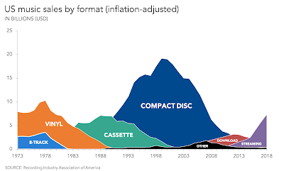
What is an Area Chart?
An Area Chart is a type of graph that displays quantitative data visually through the use of filled regions below a line or between multiple lines. It is particularly useful for showing changes in quantities over time or comparing multiple data series.
The area is filled with color or shading to represent the magnitude of the values, and this makes area charts a great tool for visualizing the cumulative total or trends. Area charts are often used in:
- Time-series analysis to show trends over a period.
- Comparing multiple variables (stacked area charts can display multiple categories).
- Visualizing proportions, especially when showing a total over time and how it is divided among various components.


Key Characteristics of an Area Chart
- X-axis typically represents time, categories, or any continuous variable.
- Y-axis represents the value of the variable being measured.
- Filled areas represent the magnitude of the values, making the visual easier to interpret in terms of volume or proportion.
- Multiple series can be stacked to compare different data sets, or displayed side-by-side to analyze variations over time.
Types of Area Charts
-
Basic Area Chart: A single area chart that shows the cumulative values of a single series.
-
Stacked Area Chart: A chart that shows multiple data series stacked on top of one another, useful for comparing parts of a whole over time.
-
100% Stacked Area Chart: A variation where the area values are normalized to 100%, showing the percentage contribution of each series to the whole.
Why Use an Area Chart?
- Time Series Trends: They are excellent for visualizing data that changes over time, such as stock prices, sales numbers, or website traffic.
- Part-to-Whole Relationships: They help to highlight how individual components contribute to a total value, especially in stacked charts.
- Visual Impact: Area charts are visually engaging and can make complex trends more intuitive, especially when dealing with multiple datasets.
Creating an Area Chart in R
R provides a wide range of libraries for creating area charts, but the most commonly used libraries are ggplot2 (for basic visualizations) and plotly (for interactive charts).
Example 1: Basic Area Chart in R using ggplot2
-
Install and load necessary libraries:
install.packages("ggplot2") library(ggplot2) -
Prepare the data: We will create a simple time series dataset.
# Create a data frame for example data <- data.frame( Year = seq(2000, 2020, by = 1), Sales = c(5, 6, 7, 8, 9, 11, 13, 14, 15, 18, 20, 23, 25, 27, 30, 33, 35, 38, 40, 43, 46) ) -
Create the area chart:
ggplot(data, aes(x = Year, y = Sales)) +
  geom_area(fill = "skyblue", alpha = 0.5) +  # Area with color
  labs(title = "Sales Over Time", x = "Year", y = "Sales") +
  theme_minimal()
This creates a simple area chart where the area under the line is filled with color. The
alphaparameter controls the transparency, and thegeom_area()function is used to draw the filled area.
Example 2: Stacked Area Chart in R using ggplot2
-
Prepare a dataset with multiple series: For this, we will create a dataset with sales of three products over several years.
# Create a sample data frame for stacked area chart data_stack <- data.frame( Year = rep(2000:2010, each = 3), Product = rep(c("Product A", "Product B", "Product C"), times = 11), Sales = c(10, 15, 5, 12, 16, 6, 13, 18, 7, 14, 20, 8, 15, 22, 9, 16, 24, 10, 17, 26, 11, 18, 28, 12, 19, 30, 13, 20, 32, 14, 21) ) -
Create the stacked area chart:
ggplot(data_stack, aes(x = Year, y = Sales, fill = Product)) +
  geom_area() +
  labs(title = "Sales of Products Over Time", x = "Year", y = "Sales") +
  theme_minimal()
Here, the chart will show the sales data for three products stacked on top of each other, making it easy to compare their contributions over time.
Creating an Area Chart in Python
Python, with libraries such as Matplotlib and Seaborn, provides a versatile environment for creating area charts. Additionally, Plotly can be used for interactive charts.
Example 1: Basic Area Chart in Python using Matplotlib
-
Install and import necessary libraries:
import matplotlib.pyplot as plt import numpy as np -
Prepare the data: Let's create a simple time series dataset.
# Create a simple dataset years = np.arange(2000, 2021) sales = [5, 6, 7, 8, 9, 11, 13, 14, 15, 18, 20, 23, 25, 27, 30, 33, 35, 38, 40, 43, 46] -
Create the area chart:
plt.fill_between(years, sales, color="skyblue", alpha=0.5)
plt.title("Sales Over Time")
plt.xlabel("Year")
plt.ylabel("Sales")
plt.show()
This creates a simple area chart with the
fill_between()function, which fills the area between the curve and the x-axis.
Example 2: Stacked Area Chart in Python using Matplotlib
-
Prepare a dataset with multiple series: Let's create a dataset for three products.
# Create stacked sales data for three products years = np.arange(2000, 2011) product_a = [10, 12, 13, 14, 16, 18, 19, 21, 22, 23, 25] product_b = [15, 16, 18, 20, 22, 24, 25, 26, 28, 30, 32] product_c = [5, 6, 7, 8, 9, 10, 12, 14, 16, 18, 20] -
Create the stacked area chart:
plt.stackplot(years, product_a, product_b, product_c, labels=["Product A", "Product B", "Product C"], alpha=0.6)
plt.title("Sales of Products Over Time")
plt.xlabel("Year")
plt.ylabel("Sales")
plt.legend(loc='upper left')
plt.show()
This stacked area chart shows the cumulative sales for each product over the years, with a legend identifying each product.
When to Use an Area Chart?
- Time-Series Data: Area charts are excellent for visualizing how a quantity changes over time. They can easily highlight growth, declines, and trends.
- Proportional Data: When you want to display how individual parts contribute to a whole (such as multiple categories in sales or population segments), stacked area charts are particularly useful.
- Part-to-Whole Relationships: When the focus is on showing how individual components contribute to an overall total, stacked area charts provide clear visual representation.

Conclusion
Area charts are a fantastic tool for visualizing trends over time and comparing how different parts contribute to a whole. With libraries like ggplot2 and plotly in R, and Matplotlib and Seaborn in Python, creating area charts is straightforward and highly customizable. Whether you need a simple chart to visualize trends or a stacked chart to analyze part-to-whole relationships, both R and Python have the tools you need.
By following the examples provided in this post, you should be able to effectively use area charts to represent your data and communicate insights visually.


Comments
Post a Comment