A Detailed Guide to Stacked Bar Charts with R and Python
A Detailed Guide to Stacked Bar Charts with R and Python
Stacked bar charts are a variation of bar charts where multiple data series are displayed on top of each other, allowing you to visualize the total and the individual components of the data. This makes them useful for comparing the part-to-whole relationships across different categories or time periods.
In this blog post, we'll explain what stacked bar charts are, when to use them, and show you how to create them using R and Python with code examples.
What is a Stacked Bar Chart?
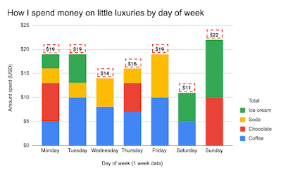
A stacked bar chart is a type of bar chart where the bars are divided into several segments, each representing a different category or subcategory. The length of each segment corresponds to the size of the subcategory, and the total length of the bar represents the overall total for that category.
Stacked bar charts are particularly useful when you want to show:
- The composition of a data set in a visual way.
- How individual parts contribute to a whole across different categories.
- Comparative data over different periods or categories.

When to Use a Stacked Bar Chart?
You should use a stacked bar chart when:
- You want to compare part-to-whole relationships across different categories.
- You have multiple categories or subcategories in your data that need to be compared side by side.
- You want to track changes over time by stacking multiple variables together.
Structure of a Stacked Bar Chart
A stacked bar chart consists of:
- Bars: The main bars that represent different categories.
- Segments: Each bar is divided into multiple segments, each representing a different category or subcategory.
- Total Height: The height of each bar represents the total sum of the segments stacked on top of each other.
Example Data
Let's assume we have data about the sales performance of three products across four quarters. The goal is to visualize how the sales of each product contribute to the overall total sales per quarter.
| Quarter | Product A | Product B | Product C |
|---|---|---|---|
| Q1 | 30 | 20 | 10 |
| Q2 | 40 | 25 | 15 |
| Q3 | 50 | 30 | 20 |
| Q4 | 60 | 35 | 25 |
The total sales for each quarter are the sum of the three products' sales.
Creating Stacked Bar Charts in R
In R, the ggplot2 library is the go-to tool for creating most types of visualizations, including stacked bar charts. Here's how you can create one using the example data.
Step 1: Install and Load the Required Libraries
First, you need to install and load the necessary libraries.
install.packages("ggplot2")
library(ggplot2)
Step 2: Prepare the Data
We need to reshape the data so that it's in a "long" format, where each row represents a single observation. We can do this using the reshape2 library.
install.packages("reshape2")
library(reshape2)

# Create the data
data <- data.frame(
  Quarter = c("Q1", "Q2", "Q3", "Q4"),
  Product_A = c(30, 40, 50, 60),
  Product_B = c(20, 25, 30, 35),
  Product_C = c(10, 15, 20, 25)
)

# Reshape the data into long format
data_long <- melt(data, id.vars = "Quarter")
colnames(data_long) <- c("Quarter", "Product", "Sales")
Step 3: Create the Stacked Bar Chart
Now, we can use ggplot2 to create the stacked bar chart.
ggplot(data_long, aes(x = Quarter, y = Sales, fill = Product)) +
  geom_bar(stat = "identity") +
  labs(title = "Sales Performance by Product", x = "Quarter", y = "Sales") +
  scale_fill_brewer(palette = "Set3") +
  theme_minimal()
Explanation:
geom_bar(stat = "identity"): This tells ggplot to use the actual values for the bars (not counts).aes(x = Quarter, y = Sales, fill = Product): We map theQuarterto the x-axis,Salesto the height of the bars, andProductto the fill color of the bars.scale_fill_brewer(palette = "Set3"): We use a color palette for the products.labs(): Adds labels for the title and axes.
Result:
You should now see a stacked bar chart that represents the sales of the three products over four quarters.
Creating Stacked Bar Charts in Python
In Python, Matplotlib and Seaborn are popular libraries for creating visualizations. Below, we'll use Matplotlib to create a stacked bar chart.
Step 1: Install and Import the Required Libraries
Install the necessary libraries if you haven't already:
pip install matplotlib pandas
Now, import them:
import matplotlib.pyplot as plt
import pandas as pd
Step 2: Prepare the Data
In Python, it's easy to work with data using Pandas DataFrames. Let's create the same example data in Python.
# Create the data
data = {
    'Quarter': ['Q1', 'Q2', 'Q3', 'Q4'],
    'Product A': [30, 40, 50, 60],
    'Product B': [20, 25, 30, 35],
    'Product C': [10, 15, 20, 25]
}

# Convert the data into a DataFrame
df = pd.DataFrame(data)
Step 3: Create the Stacked Bar Chart
Use Matplotlib to plot the stacked bar chart.
# Plot the stacked bar chart
df.set_index('Quarter').T.plot(kind='bar', stacked=True, color=['lightblue', 'lightgreen', 'lightcoral'])

# Add labels and title
plt.title('Sales Performance by Product')
plt.xlabel('Quarter')
plt.ylabel('Sales')
plt.xticks(rotation=0)

# Show the plot
plt.show()
Explanation:
df.set_index('Quarter'): We set the "Quarter" column as the index for easier plotting.T.plot(kind='bar', stacked=True): This tells Pandas to create a bar chart where the bars are stacked.color=['lightblue', 'lightgreen', 'lightcoral']: We specify colors for each product.plt.xticks(rotation=0): This ensures the x-axis labels are not rotated.
Result:
You should now see a stacked bar chart representing the sales performance of the three products across the four quarters.
When Not to Use a Stacked Bar Chart
While stacked bar charts are great for comparing parts-to-whole, there are cases where they might not be the best choice:
- Too many categories: If you have too many segments in a bar, it can become hard to read. A stacked bar chart works best with fewer categories (usually less than 5).
- Comparing individual segments: If you need to compare individual parts of each category in detail, stacked bar charts can be misleading, as it’s difficult to compare the length of segments across bars.
In those cases, you might consider other types of visualizations such as grouped bar charts or line charts.
Conclusion
Stacked bar charts are an excellent way to visualize the composition of data and track changes over time. Both R and Python provide simple methods for creating stacked bar charts, with libraries like ggplot2 in R and Matplotlib in Python offering customizable and powerful tools.
- R: Use
ggplot2andreshape2for reshaping your data and plotting the stacked bar chart. - Python: Use Pandas with Matplotlib for easy and effective plotting.
Stacked bar charts are useful for showing how individual components contribute to a total, and they can be used across various domains, including sales, demographics, and financial data.
Happy visualizing!


Comments
Post a Comment